Picnic Pals
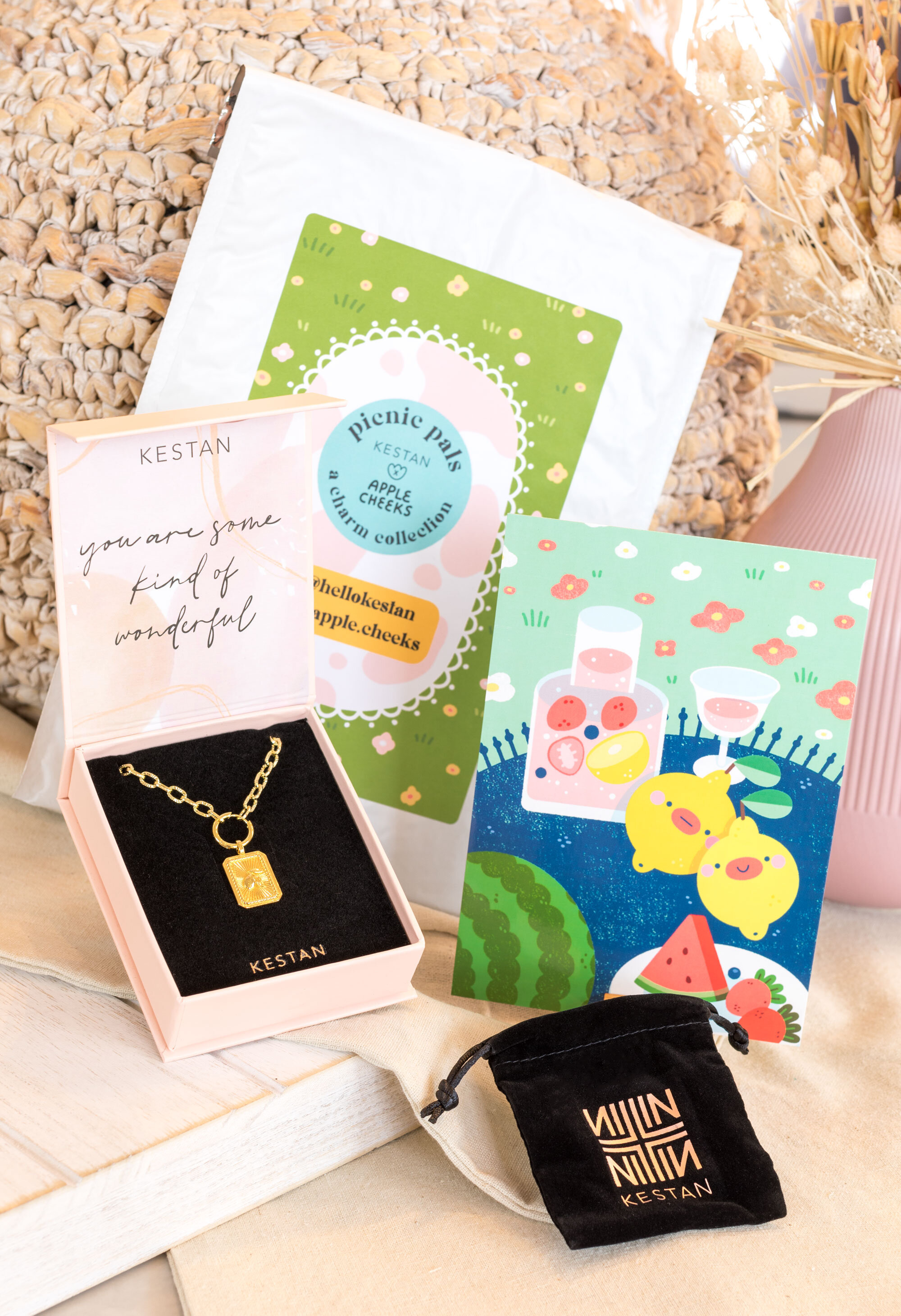
A Charm Collection by KESTAN x Apple Cheeks. I had the wonderful opportunity to work with Stephanie on this collaboration! She worked on the charm designs while I worked on the art print illustrations.
Shop the collection here
This collection features 5 charms that come in both gold and silver tones. Each charm comes with a matching art print illustrated by me!
HERE’S THE COLLECTION!
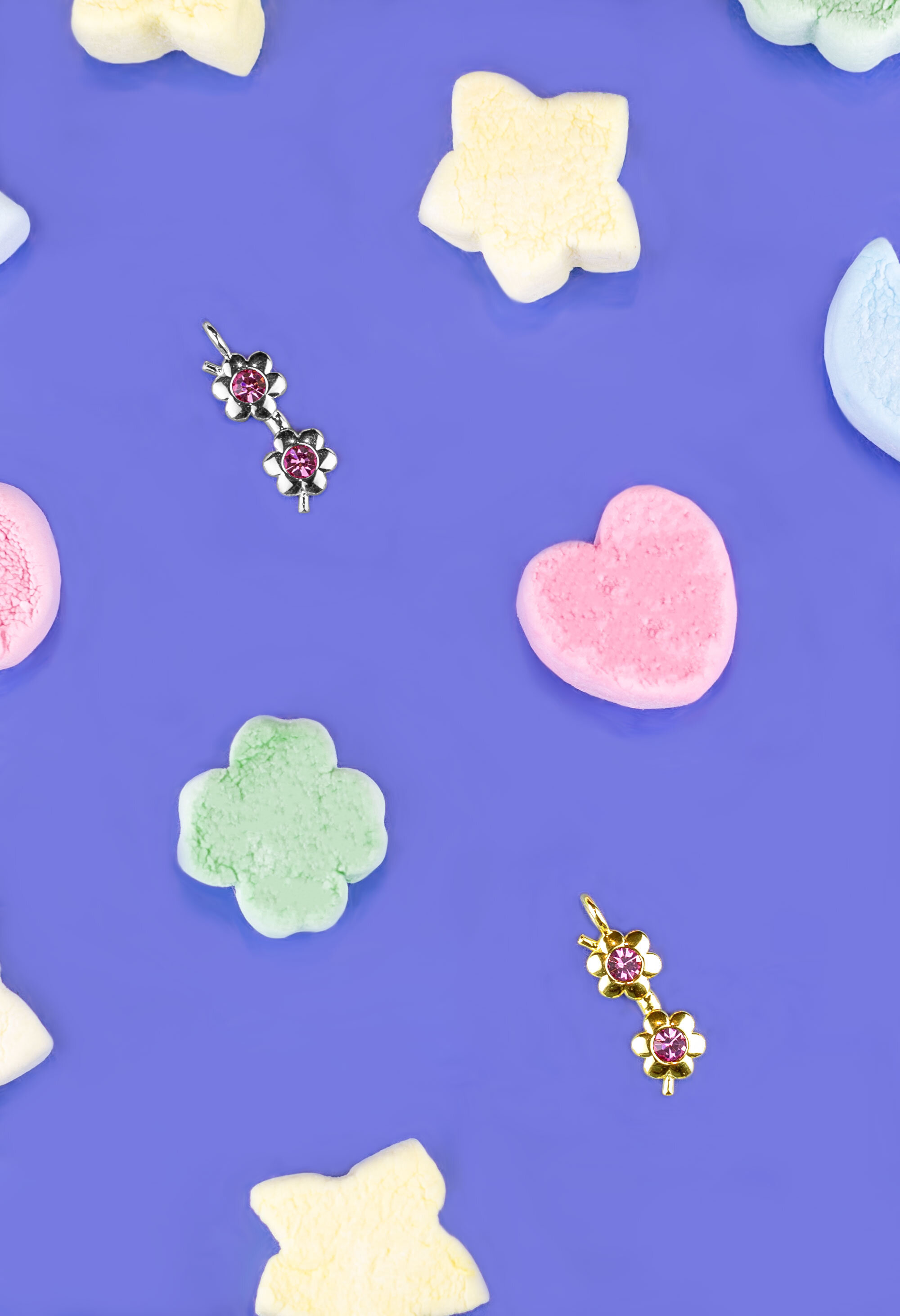
Daisy Sunnies
We had talked about the idea of “rose-colored glasses” and this was a more fun and optimistic take on that trend. The little flower lenses are meant to be playful and cheeky, and we really tried to hit something that looked whimsical, fun, and joyful. The pink stones speak for themselves, and the color is light enough that it doesn’t look like a costume or toy jewelry, but rather a more grown-up version of something fun you can wear season after season.
-Stephanie from KESTAN
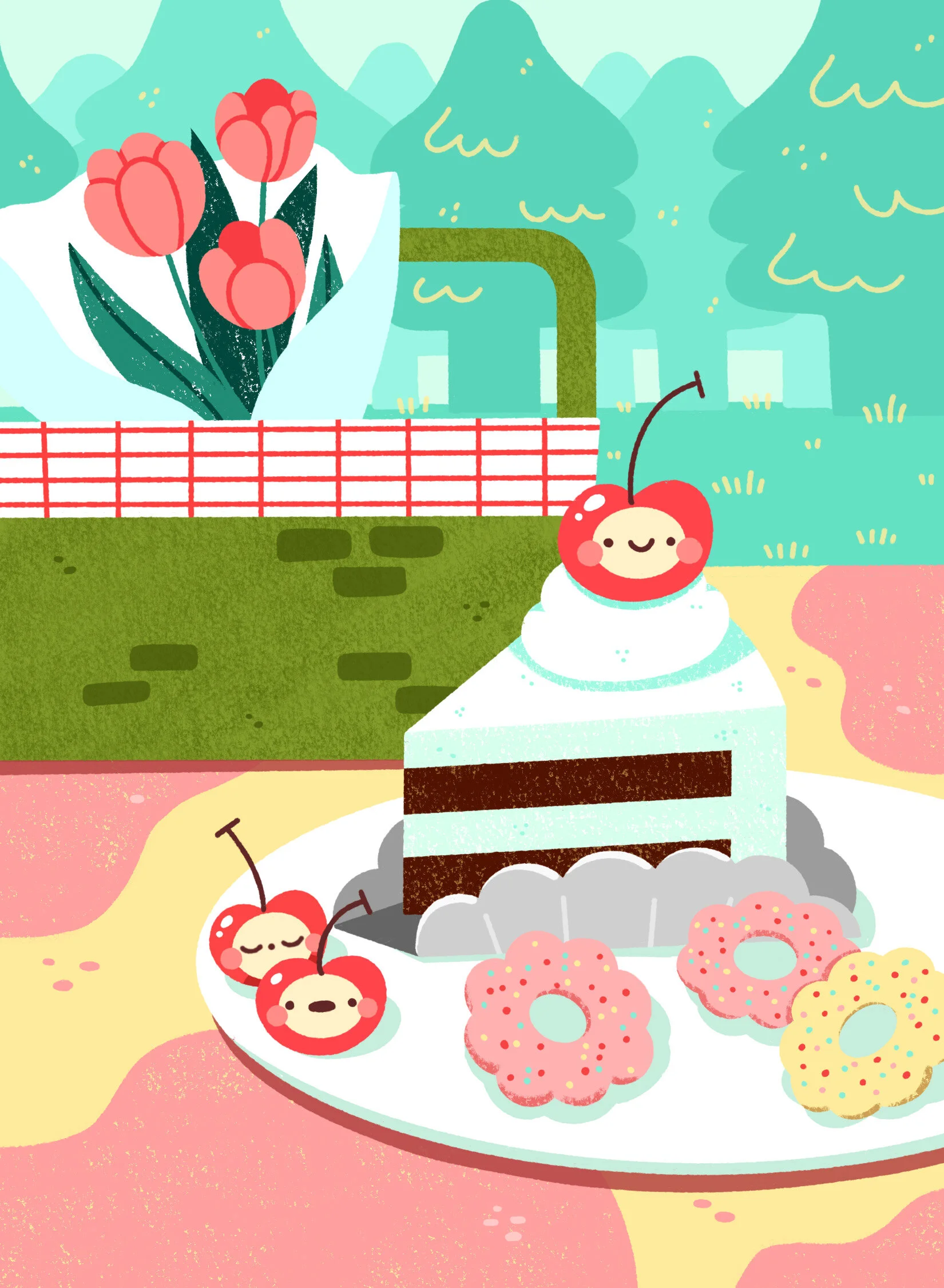
Mon Cherry
“This was a take on updating the classic cherry. Make the cherry a little heart was a sweet way to make this piece more fun and cute. The contrast between the red and the green leaf really makes this piece pop. We balanced the colors by making the actual construction of the piece more dainty and delicate so that it has a softer more jewelry-like feel to it (less like, hey, I’m wearing cherries).”
-Stephanie from KESTAN
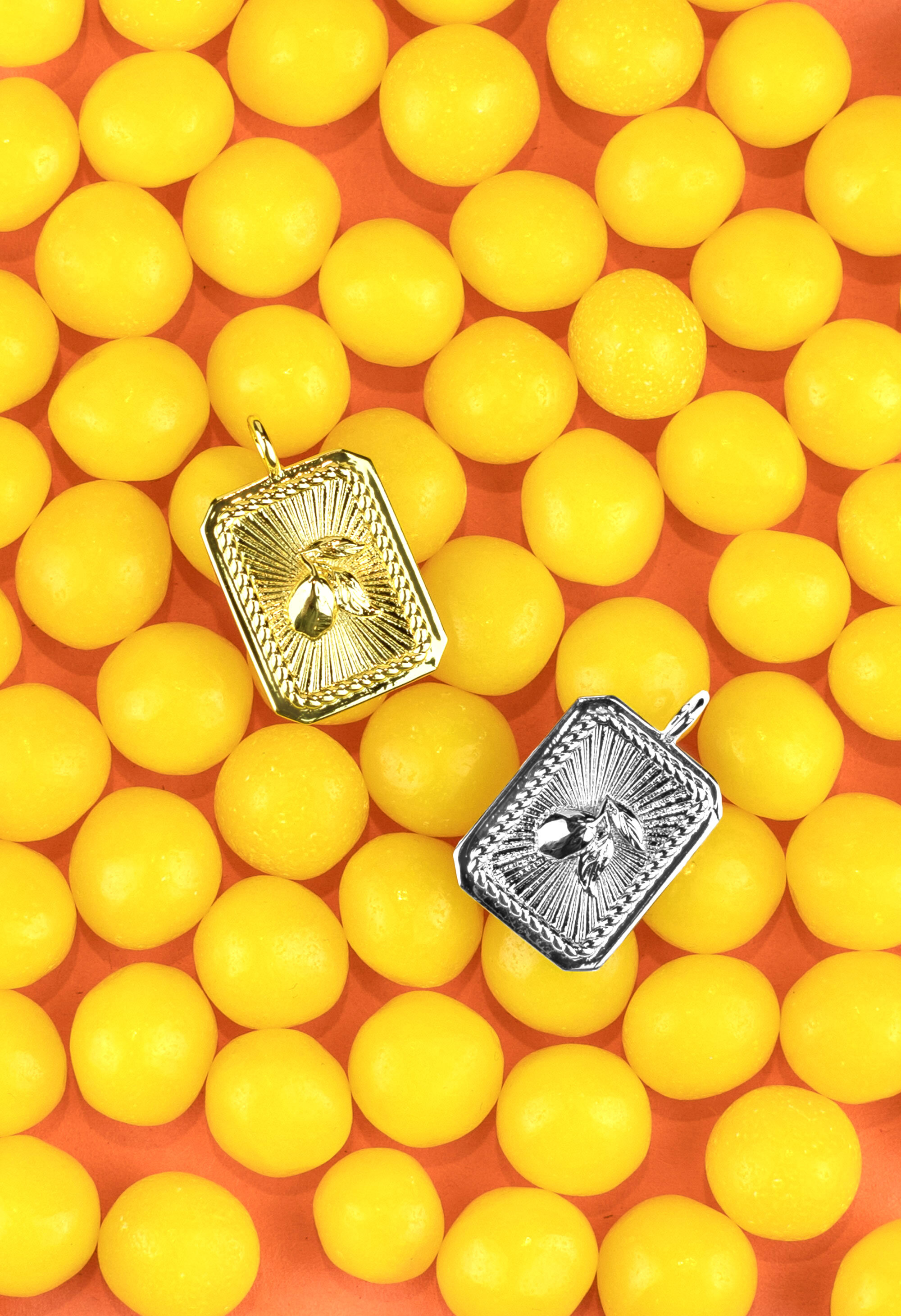
Zest Friends
“Lemons symbolize love and friendship, which I think is super cute because it ties into your illustration with the lemon friends hanging out (and the name being Zest Friends). The design itself takes on a three-dimensional perspective on the traditional medallion. The lemon is elevated and pops out for a really cool 3D effect and also features a sunburst design that radiates outwards. (Lemons are yellow….so is the sun…maybe there’s a tie there, lol. But it’s not really intentional. It’s more of the idea that the lemon feels like a “sunny” fruit to me. Something that’s optimistic and joyful, and the medallion mimics that brightness). The braided detail grounds everything together. Overall, the design is meant to be super 3D and helps reflect light beautifully for a medallion that REALLY shines.”
-Stephanie from KESTAN
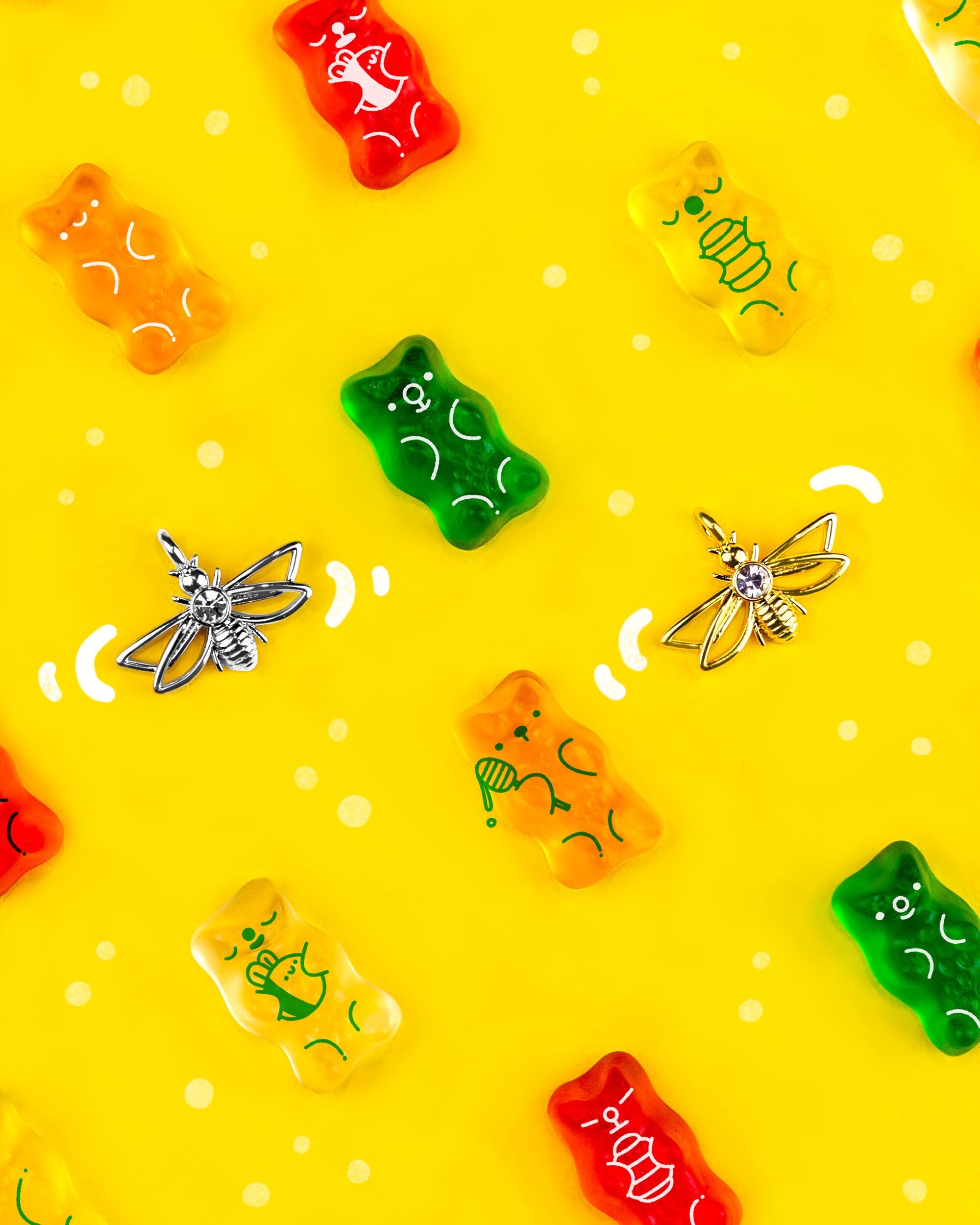
Bee mine
“For the bee, I wanted to create something that wasn’t a traditional depiction of a bumble bee. The wings are hollow to try and capture the feeling of how lightweight and translucent bee wings actually are. The body features a single round cut stone as a way to add some sparkle to the pendant and draw attention to the center. The butt (I’m not sure of a more eloquent way to put it, haha) takes the striped motif of a bee and makes it 3D so it’s got a more streamlined and elegant look to it. This is definitely a super cute and cool option for people who like bee jewelry but want a more unique take on it.”
-Stephanie from KESTAN
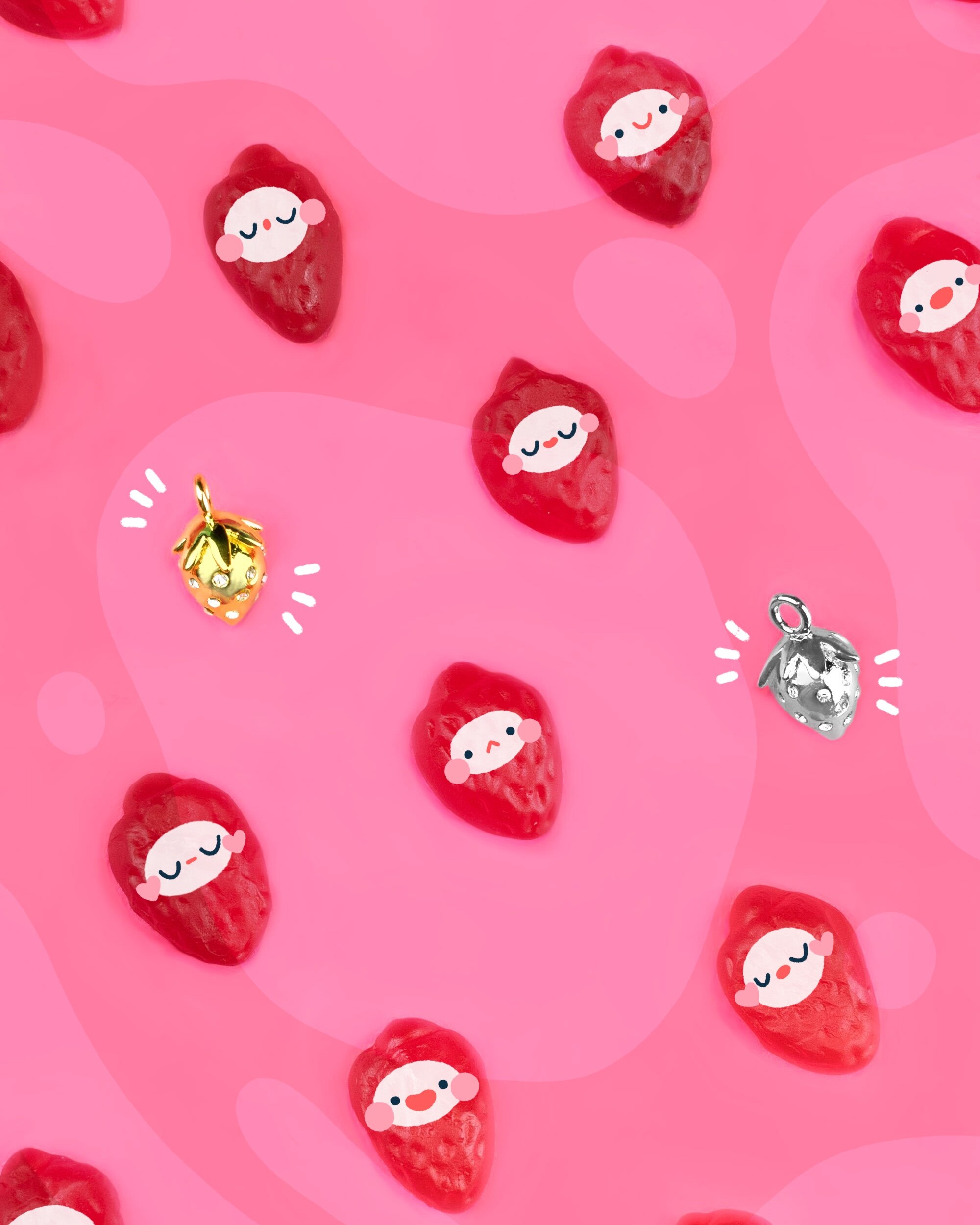
Berry Baby
“The goal for this piece was to create something super 3D and taking the adorable strawberry and making it into something that’s everlasting. It’s cast in a 3D mould so it looks exactly like a strawberry - leaves and all! This piece is fun because it looks a little different from every angle since the leaves and stone placement is different on every side. This makes it look more real and cute. The seeds are clear stones, because who doesn’t love a little bit of extra sparkle?”
-Stephanie from KESTAN
progress sketches + photos
There was a lot of back and forth with ideas and sketches till we landed on the final 5 illustrations.
This was some of the behind the scenes photos from Stephanie’s end while she worked on the charms.
I made this video talking about the collection & the process of how it all came together!


